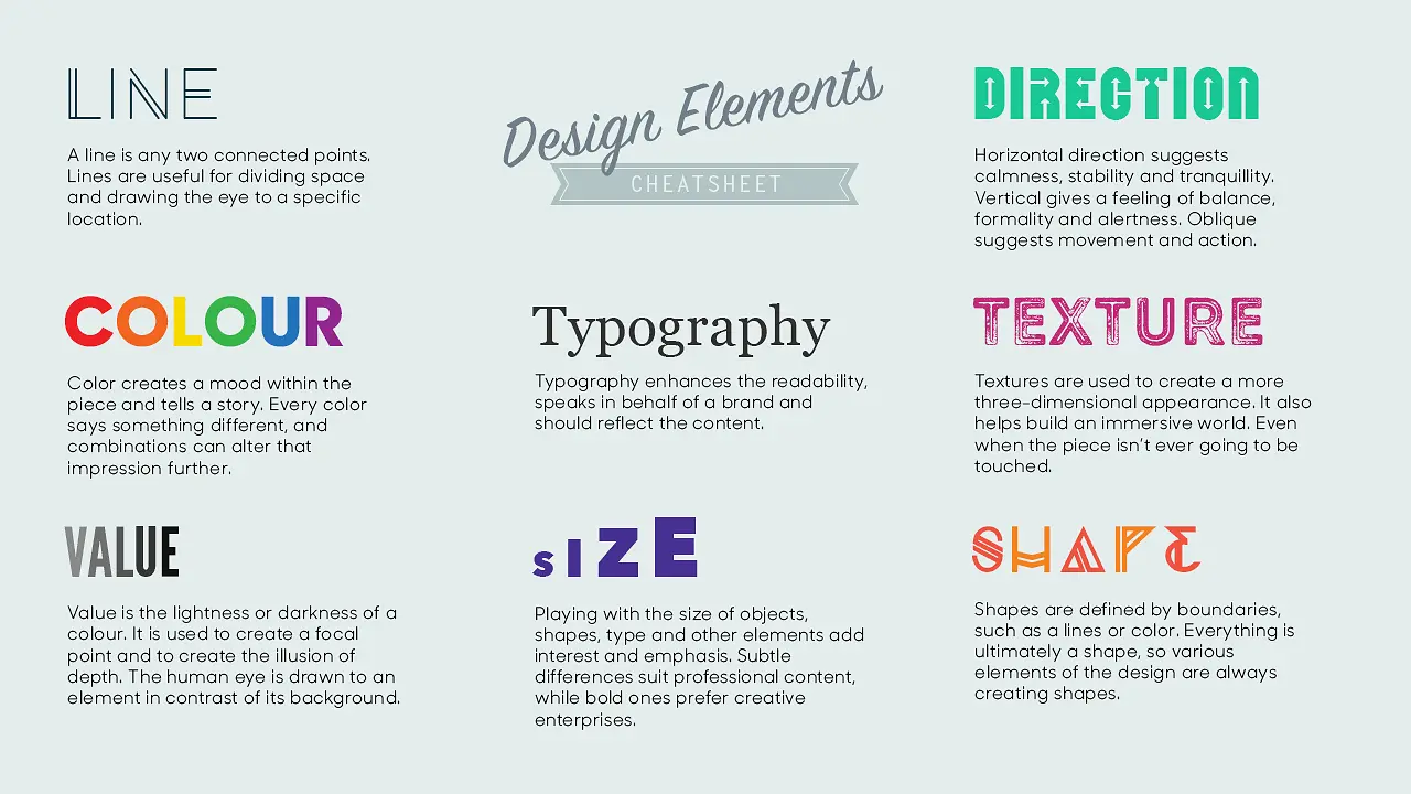
Lines are used in graphic design to create visual connections, separate elements, add style, and guide the viewer’s eye through a composition, ultimately improving the overall aesthetics and communication of the design.
The lines convey emotions to the viewer and make the design appear clean, neat and tidy. That’s why it’s important for graphic designers to understand everything about them.
And this article covers all the basics you need to know about lines.
Varieties of Lines in Graphic Design
With distinct characteristics and purposes, here are the 5 most popular types of lines in graphic design:
- Straight lines
- Curved lines
- Dotted lines
- Zigzag lines
- Parallel lines
Straight Lines

One of the most common lines in graphic design is the straight line. You’ll often find these lines in geometric shapes like triangles, rectangles, and squares.
Straight lines are primarily used to provide a clean, organized appearance to a design, offering a neat and precise look. They also serve to divide space within the design and direct the viewer’s attention to key elements.
Curved Lines

These lines are used to represent movement, rhythms and fluidity in graphic design. Curved lines appear more natural and flexible.
Curved lines are used to display a variety of messages by changing their thickness and shape, such as: smoothness, smoothness, or movement.
Dotted Lines

Dashed lines are a series of dots, with each dot equally spaced. Designers use these lines in map diagrams and educational materials. Graphic designers also use dotted lines to add a sense of texture to a design and create patterns.
Zigzag Lines

When a line in a series has consecutive twists and turns and opposite angles, the line is called a zigzag line. They create a feeling of tension, energy and movement. Designers mainly use zigzag lines to represent lightning, waves, and dangers.
Parallel Lines

If you see two lines that are exactly the same distance apart, never intersect, and have the same direction, you know they are parallel lines. They are used for creating textures and creating a double border for a design.
Line properties
Different lines have different properties, which mainly depend on their width, length, direction and texture.
Broad
The width of a line indicates how thin or thick that line is. The wider the line, the more bold it conveys.
length
This means the length of a line from start to finish. The length of the line indicates mobility and the longer a line is, the more mobility it shows. The shorter a line is, the stiffer it is.
Address
Direction refers to the sense of direction that the line represents for a design. The mood and emotions of the designs are staged correctly and appropriately under my direction. Vertical lines convey a feeling of stability and formality, while horizontal lines convey a feeling of calm and serenity.
Texture
Whether the outer surface of a line is smooth or rough. Whether the surface has patterns or not. All of these aspects fall under the texture of a line. The texture of a line gives it dimension and depth.
Color
We all know that colors have an emotional component. They can also trigger different moods and feelings. That is why the color of a line plays a very important role. Different colors can be used to create contrast, accent or harmony in a design.
6 Reasons Lines Matter in Graphic Design
- Conveys different emotions: Lines can help convey emotions such as calm, chaos or drama.
- Connecting or separating elements: Lines are a perfect graphic design element for connecting or separating elements, for example in print or packaging design or on websites where organized structure such as borders, frames or sections is required.
- Create hierarchy: Creating a hierarchy using lines can help create visual flow between sections.
- Adds Dynamics: A line pack can help create a sense of movement or action.
- Create textures and patterns: By varying line thickness, spacing, angles, and colors, designers can create a variety of visually appealing textures and patterns.
- Creates aesthetic appeal: With the help of lines we can satisfy the viewer’s eye and thus convey general information.
Examples of Effective Line Use in Graphic Design
Lines are a fundamental element that can significantly influence a design’s success. Here are some examples of how lines have been effectively utilized in graphic design:
- Nike’s “Just Do It” logo is a great example of how an iconic logo can be created from a single line. The simple and elegant design of the “Swoosh” conveys a sense of movement and action that fits well with the Nike brand, which is one of the most recognizable logos in the world.
- The New York Times Magazine is a good example of how thick, bold lines can add a sense of drama and impact to a design. The magazine features a bold, dynamic layout with strong black lines to separate and organize content. Lines help create a sense of structure and hierarchy by guiding the reader’s eye across pages and highlighting important content.
- The Spotify logo is an example of how curved lines can create a feeling of connection or sound waves. The lines attract attention and create a sensation of movement.
- In art, lines can help reinforce the overall message of the creation. We can find lines in paintings, comics, modern art and more.
- The Coca-Cola bottle features a unique contour shape designed to be easily recognizable and stand out from other soft drink bottles. The curved lines of the bottle design also give it a sense of movement and fluidity.


